PowerBand Graphics recently had the opportunity to help Coach2Win rebrand their company. Here’s the story of their business, how we worked with them and the final result.
Coach2Win is a business and personal development coaching company. Their mission through coaching and training is leading their clients to become high performance individuals and companies, unleashing their human potential. Coach2Win will always maintains principles of honesty, integrity, open mindedness, community involvement, and being respectful.
Lori Botz is the owner and head coach of Coach2Win. She has coached individuals, professional sales people, business owners, and managers closing over 3 million dollars in business in 2009. Last month she came to PowerBand Graphics, interested in improving their company’s image with a new logo, identity and advertising. Below was their old logo. After working with them and getting to know Lori, it was clear she has an incredible amount of enthusiasm, energy and business acumen. While the old logo was serviceable, it was clear more could be done to showcase those qualities.
PowerBand Graphics sat down with Lori and worked with her to establish what qualities she wanted to highlight with her image. Quality branding isn’t just about creating a design, it’s about finding the ideal market and creating an brand directed specifically at them. Working with businesses had become primary importance to her company so it was clear we needed it to be professional and business friendly. After working with her, we contacted some of her clients to get their opinion on Coach2Win’s strengths in addition to areas she may need to focus on.
While working with her and interviewing people it was clear Lori is energetic and wants to make sure she maintains a fun environment with her and her clients. There’s also a transformative process as she works with her clients. She helps her clients reach their goals by identifying obstacles and providing common sense business expertise. She helps her clients transform the way they think about problems and the solutions. First up was creating a logo that met those qualities. After rounds of concepts and revisions, here’s the results.

The logo is the core component to a business identity. It is the first thing a customer sees and will often be the defining mark that visually makes a company memorable. It should express the personality of the company, employees and its services.
For Coach2Win the logo needs to express professionalism and confidence above everything else. Since the main service is providing business advice and holding the clients accountable, so too must Coach2Win be held in that high regard to be taken seriously.
At the same time the service that Coach2Win provides is a very personalized one. Tailored to each individual. There is a warmth and enthusiastic side to this process and that should be reflected as well. In this case the number “2” becomes that fun, transformative preposition. It’s that process that is unique, inviting and even magical. Everything else should be confident business but the technique in how it’s accomplished is what defines it.
Color is also an important factor in defining a business. Emotional response in the target audience must be taken into consideration. Since Coach2Win works so heavily with businesses a traditional business color is appropriate. At the same time adding the complementary, bold and inviting orange emphasizes the fun and outgoing nature of the business.
Since Coach2Win expressed a desire to focus on businesses, when space permits, the tagline should be included with the logo to help clarify the services.
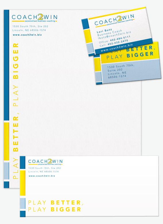
From there we created Coach2Win’s identity components. This included business cards, letterhead and envelopes. Simple things like official letterhead and envelopes can help reinforce a company’s image and brand.
In this case the important main information is included in a way that matches the company aesthetic. Once again, the company mantra is very obvious “Play Better, Play Bigger” almost subconsciously motivating people when the coaches arent’ even there.

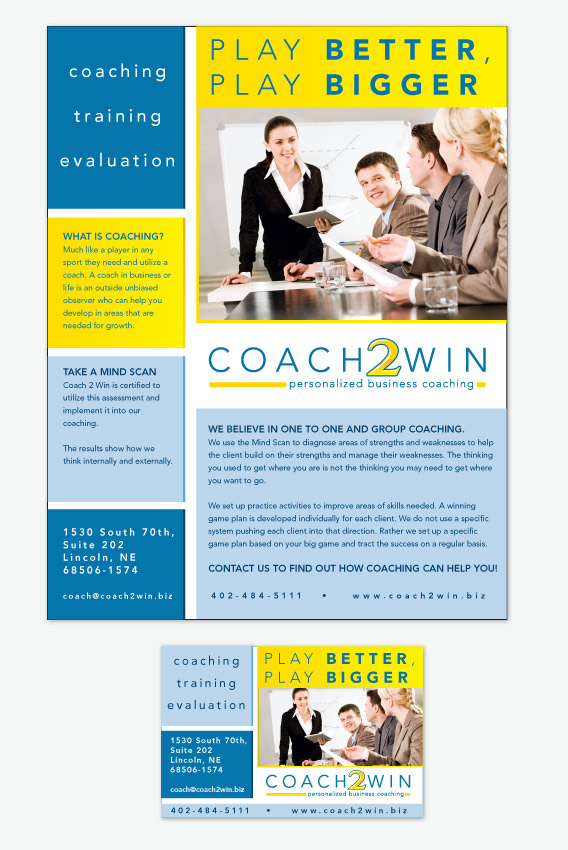
Similarly, the advertising for Coach2Win should show a business that practices the ideals it teaches. The advertising should be structured and consistent but also fun and inviting.
The company message is important and central to the ad design. “Play Better, Play Bigger” hints at the what the business can help people with but is abstract enough to entice readers to learn more.

Larger ads should explain more about the coaching and benefits. They should be able to explain clearly what coaching means and possibly even include testimonials. This particular ad style can be modular. The grid like structure allows sections to be easily arranged to show photos of coaches, testimonials or info for upcoming coaching events.
The imagery should reflect the end results of successful coaching. Successful businesses and business people. The image here reflects what is a goal for many people starting out their business, confidently public speaking.
So there you have it! The Client Showcase for Coach2Win. Branding for businesses is important and PowerBand Graphics is here to help businesses of all size. Feel free to contact us for more information on what professional branding can do for you.


You did an amazing job on Coach 2 Win. It’s a really professional look now. Keep up the good work!