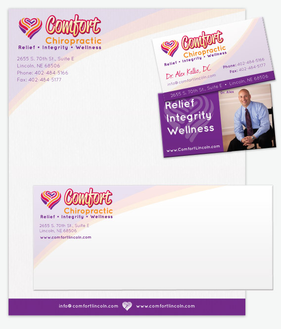
This month’s Client Showcase features Dr. Alex Kallio and his company, Comfort Chiropractic. Comfort Chiropractic is an award winning Lincoln based Chiropractic facility. They have won the 5 Star Quality Service Award by Integrity Management for providing their patients with the best in service and value. After getting to know Dr. Kallio and his company a bit it was clear he provides extremely high quality work. The business provides more than just a place to go when you’re in pain, it’s a place to go to when you want to feel good and stay that way. They promote preventative wellness, modern techniques, community involvement and personalized care.
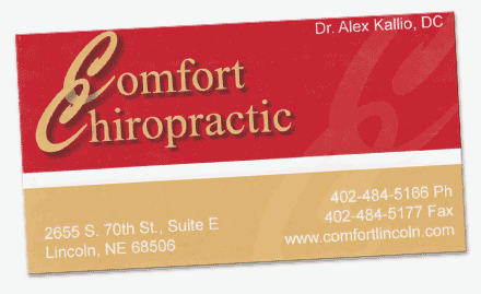
In a market like Lincoln’s, it’s important to find a way to differentiate what makes Comfort Chiropractic different than other Chiropractors. What makes Comfort Chiropractic unique and how can we use design to promote those qualities? First of all Dr. Kallio and his staff provide more than just Chiropractic services. Along with that core, there’s rehabilitation, nutrition counselling and physical strengthening they provide for their customers. They have a modern yet warm and inviting facility. It was clear that traditional and possibly cliche chiropractic aspects like spinal images weren’t going to do this business and the people who work there justice. Their old branding seen below, while serviceable, was not reflecting the best parts of the company.


 Comfort Chiropractic strives to become synonymous with quality chiropractic care in Lincoln Nebraska. By crafting a brand that showcases that as well, the business clarifies the message to current and potential clients. Design is all about clarification and emotion, if your business relies on those things at all then you need to consider professional branding as well!


Leave A Comment
You must be logged in to post a comment.